Analytics Builder user guide (customization)
Getting started
Brands can access the Analytics Builder through the Conversational Cloud UI, from the messaging real-time dashboard, queue health dashboard, and campaign dashboard.
It is important to note that LivePerson Support does not troubleshoot custom dashboards created by users; only dashboards stored within the Predefined Dashboards folder are maintained and supported by LivePerson Technical Support.
How to access the Analytics Builder
- Log into the Conversational Cloud using your campaign manager or agent manager credentials.
- Open the dashboard by clicking the drag down icon
- Click the Analytics Builder icon on the left of the screen. A new tab will open.
Permissions
For agent managers and campaign managers to be able to view, customize or share reports in Analytics Builder, the following permissions need to be enabled in their user profile:
- View reports in Analytics Builder - allows viewing of all reports
- Customize reports in Analytics Builder - allows users to customize reports and save them within the 'My Reports' folder.
- Share reports in Analytics Builder - allows users to share reports with other account users by saving them in the 'my account folder'.
To enable permissions:
- In the 'users' tab, click on the profiles page.
- Click on the ‘agent manager’ or ‘campaign manager’ profile. The edit profile page will open.
- Under permissions, scroll down to the Analytics Builder permissions listed above and enable the permissions you wish the user to have.
- Click Save.
Data view restrictions
Analytics Builder filters data by agent groups, meaning that agent group managers can see data from their group(s) and subgroups only.
Where there are data that cannot be pre-filtered by agent group, there are also restrictions by role:
- Agent managers are not allowed to view data in the Business Activity Dashboard that cannot be filtered by agent groups.
- If a copy of the Business Activity Dashboard is saved under the ‘my account’ folder, an agent manager trying to access it will receive an error message and will not be able to see any data.
- No restrictions apply to campaign managers.
- Agent managers required to view business data available on the Business Activity Dashboard will need to be assigned the role of campaign manager as well.
Analytics Builder folders
Dashboards in Analytics Builder are saved in folders. The available folders are as follows:
- Shared reports - dashboards saved here are visible to all the users in the account.
- LE predefined dashboards: All available predefined LivePerson dashboards. See details below.
- My account: Reports that have been designed specifically for your account, created by you, other users in the account, or by the LP account team.
- Analytics reporting: Customized reports created by LP for accounts with a CSO (Customer Support Offering) package. The folder will be visible and accessible as read-only for accounts eligible for a CSO package.
- My reports - dashboards saved here are visible only to the user who created the dashboard.
Creating and managing subfolders
In the 'my account' and 'my reports' folders, users may create sub-folders to organize copies of existing dashboards. Each sub-folder can contain any number of the saved dashboards. While any user with access to Analytics Builder may view subfolders and their content, managing sub-folders is only available to users with the permission to Customize Reports.
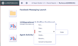
Creating a folder under “my account” or “my reports” folders
- Access Analytics Builder and navigate to one of the above-mentioned folders
- Right-click an existing dashboard and from the drop-down menu, select “New” and then “folder”
- Once the name is chosen and submitted, the icon for the new folder will appear on the screen

Alternatively, a new folder can be created by copying an existing dashboard (right-click and “copy”), or by selecting the Save As menu option from within an opened dashboard. In both options, to the right of the folder selection box, click on the create folder icon.
Deleting and renaming an existing dashboard is also available via right-clicking the folder icon.
Feature Releases
With every release, new features are added to the predefined dashboards, but not all the changes are automatically updated in the custom dashboards.
- New metrics in existing datasets - new metrics added to existing datasets in the predefined dashboards will be available in custom dashboards as well.
- New attributes in existing datasets - new attributes will be automatically added to custom dashboards but will show with only IDs as values. The attribute’s description is part of a new dataset (the dimension dataset) which is not added automatically.
- To see the attributes’ description, the user must recreate his custom dashboard by creating a new copy of the predefined dashboard.
- New datasets and visualizations - will not be added to existing custom dashboards.
- Derived metrics - will not be added to the custom dashboards.
Users are advised to create new reports often to get the latest version of the predefined dashboards.
Capabilities
A user with edit access can similarly use the builder to the use of a spreadsheet in Google Spreadsheets or Microsoft Excel. These tools as well as the builder have limitations and the following points should help you avoid interruptions to your work on the builder:
Dashboards
A dashboard is an interactive display that you can use to quickly and easily explore your business data. Dashboards allow you to:
- View visual representations of the data (called visualizations) in the dashboard to make the data easier to interpret.
- Sort and rearrange data in visualizations.
- Perform manipulations on the data to display only the information you are interested in.
- Use pre-defined, presentation-quality formatting to quickly display your data in a visually-striking way.
The Conversational Cloud comes with a set of predefined dashboards which offer ready-made reports for account data flowing into Analytics Builder from the Conversational Cloud data platform. These predefined dashboards can be used out of the box or manipulated to create customized reports which contain unique key performance indicators.
Customize a predefined dashboard
- Open any dashboard from the ‘LE predefined dashboards’ folder.
- Click the ‘save as’ option under the ‘File’ drop-down menu.
- Save a copy of the predefined dashboard under the ‘My Reports’ folder.
- Select the ‘run newly saved dashboard’ option.
- The new dashboard is now created, ready for you to customize.
Saving changes
Idle time thresholds are enforced in Analytics Builder and aligned with the Conversational Cloud platform setup. These thresholds in place protect your account. Please make sure to save your dashboard so editions will not be lost. Analytics Builder does not offer an auto-save function at this time, and it is recommended to save your work after every bulk of changes.
Share a custom dashboard
- Open the desired dashboard.
- Click the ‘save as’ option under the ‘file’ drop-down menu.
- Save a copy of the desired dashboard under the ‘my accounts’ folder.
- The dashboard will be available to all the users in the account.
Export a dashboard to PDF
- Open the desired dashboard.
- Click the ‘export to PDF’ option under the ‘file’ drop-down menu.
- In the export options window, select ‘current sheet’ to export only the selected sheet, or ‘All Sheets’ to export every sheet, and click OK.
Create subscriptions (scheduling)
Scheduling dashboards to email is currently available via your LivePerson account team.
Tabs and panels
A dashboard contains multiple layouts. To switch between the pages of data in the dashboard, or tabs, click the name of a layout tab. Each tab can contain multiple panels of content, all using the same tab filters. You can switch between panels by clicking the blue dot at the bottom of each panel.
Add a new tab
- Click the ‘+’ sign next to the names of the tabs.
- Give the tab a name by double-clicking on the name field. the existing filters will not apply to the new tab.
It is recommended to use an existing tab with its filters and modify it, rather than adding a new empty tab. The predefined tabs include all the filters needed to see the data properly. Copy a predefined tab and delete the irrelevant visualizations or modify them to fit your needs.
Copy an existing tab
- Click on the down-arrow next to the tab’s name.
- Select ‘duplicate.’
Remove a tab
- Click on the down-arrow next to the tab’s name.
- Select ‘delete.’
Add a new panel to an existing tab
- Click on the down-arrow next to the tab’s name.
- Select ‘insert panel.’
- Give the panel a name by double-clicking on the name field.
- Move between panels by clicking on the blue dot at the bottom of each panel.
Note: all existing filters on the tab will automatically apply to all panels.
Filters
You can filter the data displayed in a dashboard by selecting from various options in the filters panel. For example, a dashboard displays engagement data for several different agent groups, from 2017 to 2019. You can filter the data in the dashboard to only display data for a specific agent group in 2018.
There are two types of filters available:
- Attribute filter
- Metric filter
Add an attribute filter to the filters panel
- From the dataset panel, select the attribute you want to use to filter your data and drag it onto the Filters panel. You can place the attribute above or below the filters already displayed in the panel.
- Hover the cursor over the name of the filter you just added, then click the arrow icon. A list of options will display.
- Click on display style, then select the style you want to use to display the filter. The options are:
- Checkboxes
- Search box
- Slider
- Radio buttons
- Dropdown
- You can choose to include or exclude data using elements selected in the filter, as follows:
- To display data in the dashboard only for selected elements, select include.
- To display data in the quick dashboard for all elements except the elements that are selected, select exclude.
Add a metric filter to the filters panel
1. From the dataset panel, click the metric you want to use to filter data and drag it onto the filters panel. You can place the metric above or below the filters already displayed in the panel.
2. Hover the cursor over the name of the metric you just added, then click the arrow icon. Click on display style and select one of the following:
- To filter data by creating a qualification on a metric, select qualification.
- To filter data by choosing values on a slider, select slider.
3. Hover the cursor over the name of the metric you just added, then click the arrow icon and select one of the following:
- To filter by the metric's values, select qualify on value. For example, you can display data only for agents with engagements greater than or equal to 100.
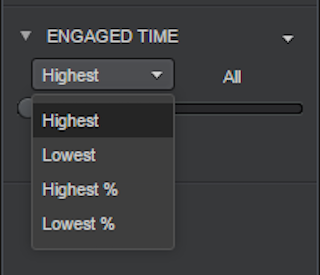
- To assign a numeric rank to the metric values and then filter by rank, select qualify on rank. A few options are available:
- To assign a numeric rank to the metric values, where 1 is the highest metric value, and then filter by rank, select Highest in the drop-down list. For example, you can display data for the ten agents with the highest MCS score.
- To assign a numeric rank to the metric values, where 1 is the lowest metric value, and then filter by rank, select Lowest in the drop-down list. For example, you can display data for the ten agent groups stores with the lowest login time.
- To filter by the top n% of metric values, select % Highest in the drop-down list. For example, if eight items are displayed in a visualization, Rank % Highest = 25 displays the top two items.
- To filter by the bottom n% of metric values, select % Lowest in the drop-down list. For example, if eight items are displayed in a visualization, Rank % Lowest = 25 displays the bottom two items.

4. There are two options to configure how users will be able to filter the data:
- To allow users to filter data by creating a qualification on a metric, perform the following steps:
- Click greater than or equal to. From the drop-down list, select the operator you want to use to compare data, such as less than or equals.
- In the field, type the value you want to use to filter data, then press ENTER. The qualification is created. To allow users to filter data by choosing values on a slider, perform the following steps:
- To allow users to filter data by choosing values on a slider, perform the following steps:
- Click and drag the endpoints of the slider to cover the range of values for which you want to filter data.
- You can choose to include or exclude data using the values selected in the slider. Hover the cursor over the metric name and click the arrow icon, then do one of the following:
- To display data in the quick dashboard only for metric values selected in the slider, select include.
- To display data in the quick dashboard for all metric values except the values selected in the slider, select exclude.
Remove a filter from the filters panel
- Hover the cursor over the name of the filter you wish to remove, then click the arrow icon. A list of options is displayed.
- Select delete.
Use a filter as a filter to another
You can choose to show only a subgroup of values in a filter by using a second filter to sort the options. For example, filter AGENT attribute by GROUP - once a specific group is selected, only agents assigned to this group will be visible in the filter.
- Hover the cursor over the name of the filter, then click the arrow icon. A list of options is displayed.
- Point to select targets, then select the other filters within the Filter panel to filter by the pre-selected filter.
Visualizations
Once the dashboard is ready, you can quickly add visual representations of the data (called visualizations) to the dashboard to make the data easier to interpret.
Add visualization to a dashboard
- Click the ‘Insert Visualization’ icon in the top bar. A new empty visualization is added to the dashboard.
- Add metrics and attributes to the visualization by drag-and-drop (to the ‘Editor’ panel or directly to the grid).
Rearrange the visualizations
To quickly rearrange the visualizations in a tab, click and drag the visualization to its new location in the tab. The other visualization will automatically be shifted and resized.
Rename a visualization
- Click on the visualization.
- Click the down-arrow icon on the top-right corner of the visualization. A list of options is displayed.
- Select ‘rename’, then type a new name for the visualization in the field.
- Press enter. The visualization is renamed.
Delete a visualization
- Click on the visualization.
- Click the down-arrow icon on the top-right corner of the visualization. A list of options is displayed.
- Select ‘Delete’.
Export a visualization
- Click on the visualization.
- Click the down arrow icon on the top right corner of the visualization. A list of options is displayed.
- Select ‘export’ and then select the type of file to export: PDF, Excel, or Data (CSV).
Metrics & attributes
Once you have added visualizations to a dashboard, you can add metrics and attributes to show data.
Providing business context to a report: attributes
Attributes provide a context in which to report on and analyze business facts or calculations. While being aware of your account’s total conversions is useful, knowing when and by whom it was submitted provides the kind of analytical depth users require daily.
For example, you have a report containing the Week, Month, and Group attributes, as well as a Conversions metric. The report displays your account’s conversions for each group, during each week and month for which data are available. Because of the attributes on the report, a substantial amount of information is available, such as which group produced the least conversions and which months saw the highest growth in conversions. Without these attributes, the report will only display the total number of conversions, meaning you will miss out on this valuable in-depth analysis.
Calculating data on a report: metrics
Metrics are objects that represent business measures and key performance indicators. They are similar to formulas in spreadsheet software. It is not an overstatement to say that the focus of almost any report is its metrics. Most of the decisions you make about the other objects to include on a report depend on the metrics you use on the report. Questions such as ”How many engagements were handled by agents during the fourth quarter?” can easily be answered by metrics.
Add attributes and metrics to a visualization
- From the Dataset panel on the left, select attributes and metrics, and drag them onto the ‘editor’ panel.
- Attributes can be added to: a. ‘Rows’ - the attribute’s values will be displayed on the rows of the grid. b. ‘Columns’- the attribute’s values will be displayed on the columns of the grid.
- Metrics can only be added to the ‘metrics’ to show data.
Remove a metric or attribute from a visualization
- Click on the metric or attribute. A list of options is displayed.
- Select ‘remove’.
You can also create your metrics. This option is useful if you would like to achieve any of the following:
- Perform additional calculations on the metrics from the datasets (such as multiplying by a constant or using a function). For example, you can subtract the values of one metric from the values of another metric, such as Logged in Time - Online.
- Create calculations that combine metrics from different datasets.
- Create totals using specific functions. You can calculate an hourly average, for example, Interactive Engagements / (Labor Time * 24).
Custom metrics are named ‘Derived metrics’. These are metrics that a report analyst can create based on existing metrics in the report. A derived metric performs a calculation on the fly with the data available on a report, without re-executing the report against the data source.
Derived metrics are not metric objects that can be re-used in other reports and documents. They are metrics that are saved and displayed only on the specific report on which they are created. You can only use metrics already existing in a report to create a derived metric.
Create a new metric
1. Right-click anywhere in the datasets panel and select ‘create metric’.
2. A new window ‘metric editor’ will open up.
3. Use objects and functions or operators to create the required formula.
a. Objects: the metrics and attributes available in the report.
i. To add an attribute or metric, double-click an object from the ‘objects’ list to the right to add it to the formula field.
b. Functions: when you create a derived metric, you can define it using a function, which allows you to create a more complex derived metric. For example, you can choose a RunningSum function to create a running sum of the Revenue (RunningSum(Revenue)) metric.
i. To create a derived metric using a function, select the function, define its arguments and parameters, and then specify the metrics on which to base the new metric.
4. Click ‘validate’ and make sure the formula is valid.
5. Name the metric and save it.
Recommendations:
- Quantity: Adding more than 3 derived metrics to a single dataset may ultimately harm the performance of your dashboard to the extent that it may be virtually unusable. We encourage you to use the existing metrics available in the builder and minimize the number of additional derived metrics you create on your own.
- Formulas: Functions that parse values stored in attributes are known to impact processing time. Similarly, adding “distinct” counting to built-in functions would also have a relatively higher impact on the processing and ultimately load time of any dashboard.
- For more information on using functions in metrics please visit this website (our 3rd-party provider).
Edit a metric
- Right-click on the metric name on the Dataset panel or Editor panel.
- Select ‘Edit.’
- The ‘Metric Editor’ window will open up allowing you to modify the metric’s formula.
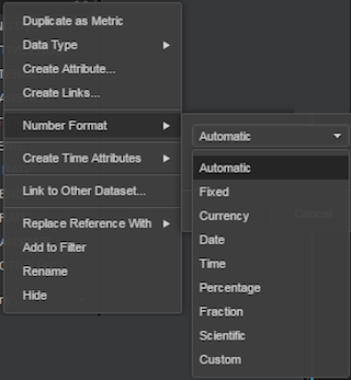
Change the format of a metric
- Right-click on the name of the metric on the datasets panel.
- Select ‘number format’ and then select the format from the available options (Currency, Date, Time, Percentage, and so on).
- Change the decimal places by clicking the ‘Increase Decimal’ or ‘Decrease Decimal’ icons.

Visualization styles
Once a visualization is created with metrics and attributes, you can display it in several ways:
Change widget style using the visualization gallery
- Click on the visualization.
- Select the desired style from the ‘visualization gallery’, on the right of the screen.
The table below lists the available styles:
| Visualization style | When to use |
| Grid | Display data in a tabular layout - multiple attributes and metrics |
| Heat Map | 1 attribute and a metric |
| Bar Chart | 1 or more metrics |
| Line Chart | 1 or more metrics1 or more attributes |
| Area Chart | 1 or more metrics1 or more attributes |
| Bubble Chart | 1 or more metrics1 or more attributes |
| Pie Chart | 1 or more attributes |
| Combo Chart | 2 or more metrics1 or more attributes |
| Network Chart | 1 or more attributes |

Graphs with more than one metric
Change the axis
- On the ‘EDITOR’ panel, right-click on the name of the metric you’d like to move the axis of. A list of options is displayed.
- Select ‘Right Axis’. The metric’s axis will move from the default left axis to a new axis on the right of the graph.
Change color shapes according to the metric names
- On the ‘EDITOR’ panel, click on the ‘Metric Names’ rectangle.
- Drag the rectangle and drop it into the ‘Color By’ section in the panel:
- The shapes will be colored differently according to the metrics.
Add a legend
- Right, Click anywhere inside the visualization (but not on the shape itself). A list of options is displayed.
- Click on ‘Show Legend.’ The legend will display on the right of the visualization.
- On hover, a few options will be displayed.
- In the top left corner - an arrow, allowing you to minimize/maximize the legend.
- In the top right corner - an ‘X’ button, allowing you to close the legend.
Formatting
Formatting a graph
Change the color of shapes
- Right-click on the shape you would like to change the color of. A list of options is displayed.
- Click on ‘Shape Fill Color’ and select a color of your choice.
Add data labels
- Right-click on the shape you’d like to add labels to. A list of options is displayed.
- Click on ‘Data Labels’ and select ‘Only Value’.
- Labels will be added to the visualization.
Thresholds
You can highlight metric data in visualization by displaying the data in different font colors, or by replacing it with an image. For example, a Grid visualization displays conversions data for different agent groups. You can use thresholds to display conversions values of less than 1,000 in red. Thresholds can make analyzing large amounts of data easier because images are easy to locate and different font colors are quickly identified.
A threshold is made up of two parts: the condition, and the formatting that will be applied to the values that meet the condition. Conditions can vary in complexity depending upon the type of threshold that is created. The data that meets the condition is considered to be data that have passed the threshold of the condition. Once data passes the threshold, formatting is automatically applied to the data.
Create a threshold for a metric
- On the selected grid, right-click on the name of the metric you’d like to define a threshold for. A list of options will display.
- Select ‘Thresholds.’ The Thresholds dialog box will open.
- From the ‘Thresholds Type’ options, select the type of formatting you want to apply to the metric values that meet the threshold condition, as follows: 1. Color-based: to create a threshold to change the background color used to display metric values. 2. Image-based: to replace metric values with an image.
- From the second drop-down list, select the color or images you want to display:
1. Color: select a set of colors to apply to the values, such as Orange, Green, Red.
2. Images: select the images you would like to display. The options include:- Arrows
- Regular Pin
- Rounded Pin
- From the ‘Based on’ drop-down list, select the metric to use to define the threshold.
- From the drop-down list that will appear once you have selected the metric, select one of the following:
- To create a threshold based on the value of the metric, select Value. For example, you can display metric values greater than 5 million in blue.
- To create a threshold based on the top x metric values, select Highest. For example, you can display the top 5 metric values in red.
- To create a threshold based on the bottom x metric values, select Lowest. For example, you can display the bottom 5 metric values in green.
- To create a threshold based on the top x percent of metric values, select the Highest %. For example, you can display the top 10% of metric values with a green flag.
- To create a threshold based on the bottom x percent of metric values, select Lowest %. For example, you can display the bottom 50% of metric values with a red flag.
- From the ‘break by’ drop-down list, select the attribute level at which you want to restart counting rank or percent values for the metric. This option is only available for thresholds based on rank or percent values.
- Each band displayed in the dialog box represents a different range of values. You can click and drag a thumb left or right along the slider to increase or decrease the range of values covered by the band.
- Further customizations are available:
- To create a new band, hover the cursor underneath the band and click on the + icon that appears to place a new band.
- To change the color applied to the range of values covered by a band, hover on the band, the band will be highlighted. Click on the band, a palette of colors will be opened. Select the new color from the palette.
- To delete a band, hover the cursor over the band, then right-click and select ‘Delete’. The band is deleted.
- You can preview your changes by clicking Apply. Once you have finished defining the threshold, click OK. The threshold is created.
Clear all thresholds applied to a metric
- On the selected grid, right-click on the name of the metric you’d like to clear thresholds for. A list of options will display.
- Select ‘clear thresholds.’ All thresholds defined for the metric are cleared, and no longer affect the display of data in the visualization.
Formatting the dashboard
Add a title
- Click the ‘Insert’ plus & arrow icon in the top bar. A list of options will display.
- Select ‘text.’ A new title bar will display.
- Click on the text bar and type your desired text.
- You can drag and drop the title bar to anywhere in the dashboard.
- You can format the text font by selecting the title bar and changing the settings on the ‘PROPERTIES’ panel.
Groups
When you have a very large dataset within a dashboard, it can be easier to work with that data by grouping it into logical subsets and viewing only one or a few of the subsets at a time.
For example, a grid displays requested engagements by the campaign. If there are multiple campaigns configured with similar properties (e.g. one for mobile and another for desktop), they can be grouped to display their aggregated data. All the data from the grid is still present, but it is grouped into smaller, more manageable sections.
Once you have added an attribute to the grid, you can perform the following steps to group the data. When you group data in a dashboard, the grouping creates a new attribute, which is marked with the fx icon. You can use this new attribute in any of your visualizations.
Group or ungroup data
- Right-click on the name of the attribute you’d like to group, on the editor panel. A list of options will display.
- Select ‘create groups.’ A new window, the ‘group editor’, will open.
- Name the new attribute.
- Name a group and add values to it by dragging them from the ‘Available’ list on the left of the window and dropping them into the ‘Selected’ section on the right.
- Click the v button once your group is complete.
- Add more groups by clicking on the ‘Add a Group’ link.
- Once you’ve finished creating the groups, click ‘Save.’
- You can now use the new attribute instead of the original attribute.
Recommendations for creating custom dashboards
Dashboards
Users are advised to recreate their dashboards every so often to get the latest version of the predefined dashboards.
Tabs
- It is recommended to use an existing tab with its filters and modify it, rather than adding a new empty tab. The predefined tabs include all the filters needed to see the data properly. Copy a predefined tab and delete the irrelevant visualizations or modify them to fit your needs.
- It is recommended to create new tabs rather than many panels in a single tab
Filters
- The filters of any dashboard must contain at least one attribute from the “Time” dataset which appears at the top of the DASHBOARD DATASETS list. Attributes of the Time dataset include DATE, DAY OF WEEK, WEEK, and MONTH.
Metrics & attributes
- It is highly recommended to limit the number of metrics included in a detailed grid that is based on attributes such as “AGENT” or “HOUR”. When pulling data for long timeframes, the performance of large grids may deteriorate. Therefore, it is recommended to either limit the number of rows (attributes) or columns (metrics) in grids that present more than a week’s worth of data.
Derived metrics
- Quantity: Adding more than 3 derived metrics to a single dataset may ultimately harm the performance of your dashboard to the extent that it may be virtually unusable. We encourage you to use the existing metrics available in the builder and minimize the number of additional derived metrics you create on your own.
- Formulas: Functions that parse values stored in Attributes are known to impact processing time. Similarly, adding “distinct” counting to built-in functions would also have a relatively higher impact on the processing and load time of any dashboard.
- Time-based derived metrics - It is recommended to use the “Custom” formatting and change the prefix of the ‘hour” attribute from “h” to “[h]”. Example: [h]:mm
Missing Something?
Check out our Developer Center for more in-depth documentation. Please share your documentation feedback with us using the feedback button. We'd be happy to hear from you.