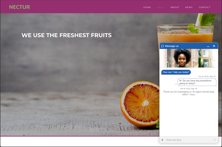
Engagement window
For Web Messaging and live chat engagements, the engagement window hosts the conversation. In the engagement window studio, brands can fully customize and tailor the window, with control over every aspect, from fonts and button style to icon colors and positioning
Using the Engagement window studio, you can:
- Customize the look and feel of the conversation window
- Add a window header, configure a picture of your agent, or add another image to the window
- Add and edit surveys
- Customize the consumer actions menu
- Configure emoji support
- and more!
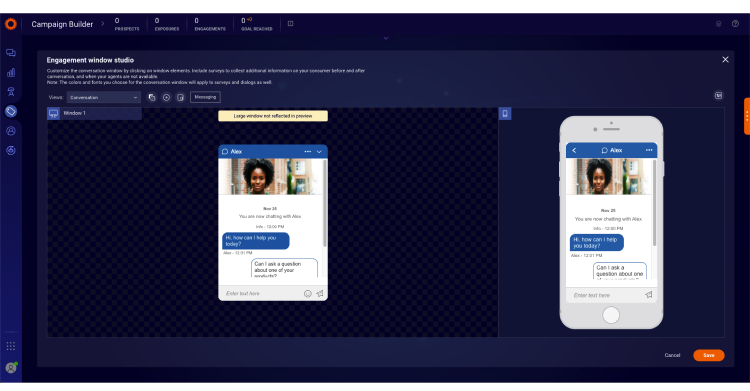
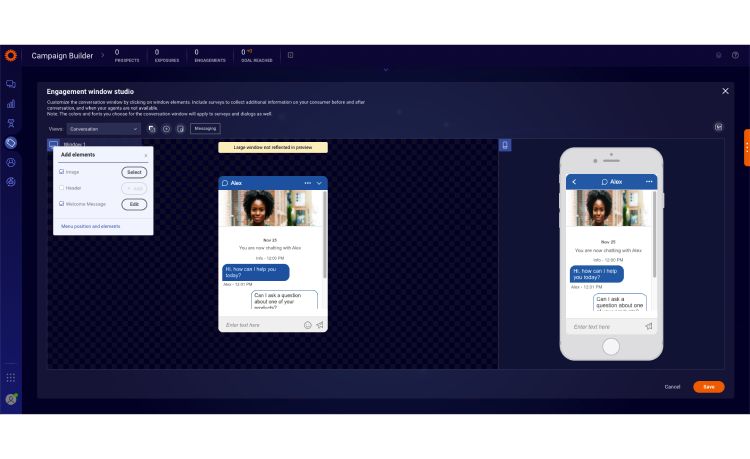
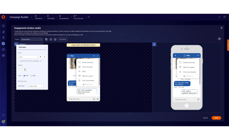
Engagement window studio basics
To provide a consistent experience across devices, you can design identical engagement windows for both desktop and mobile versions of the platform. Using the Engagement window studio, you can design a conversation window once and use it across any number of engagements.
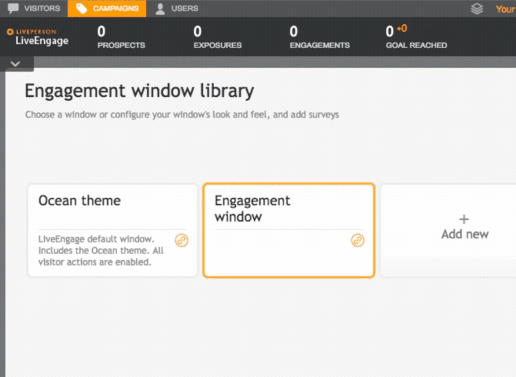
To access the Engagement window studio:
- Open the Engagement window library

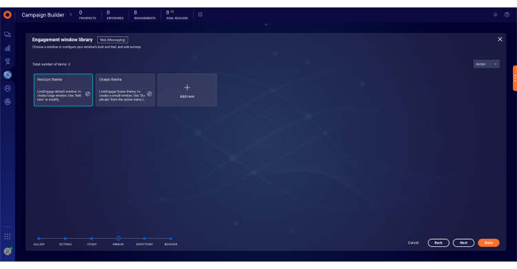
- Hover over an existing window design and click Edit or click Add new to design a new window. Once you have designed the window it will be added to your Engagement window library for future use.
- After clicking Add new, the Engagement window studio opens.
The Engagement window studio allows you to customize the look and feel of both desktop and mobile windows. Any change you perform to the design of the desktop window takes effect in the mobile window as well.
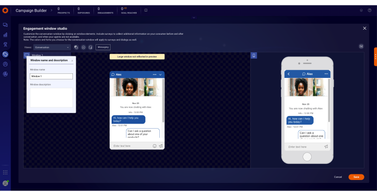
To edit the window name and description:
- Click the window name (in this example, Support)
- Enter a new window name and type in a description, the window name and description will display in the Engagement window library to help you identify different items in the library

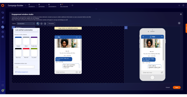
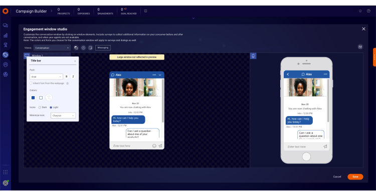
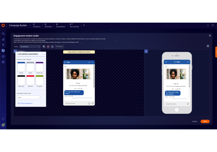
Customize the look and feel
To select a predefined color scheme for your window:
- Click the Look and feel customization button
- Select your preferred theme, you can choose a theme and use it as a base for further customization

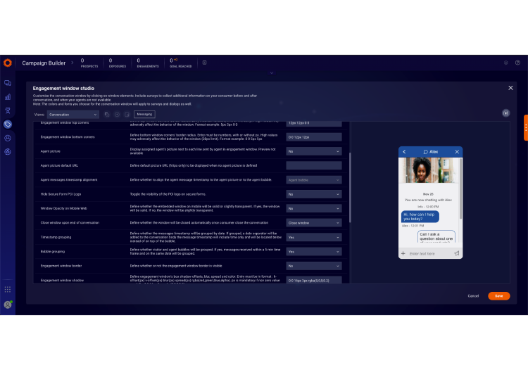
To customize conversation window elements:
You can fully customize the conversation window to suit your brand by changing the colors, fonts, visitor bubble, agent bubble, system messages, info line and window background. Select each of the window elements and follow the steps below:
- Click on an element
- From the properties window, customize the element according to your brand
- You can change the icon set of some elements to suit the background, we recommend choosing bright icons for dark backgrounds and dark icons for bright backgrounds
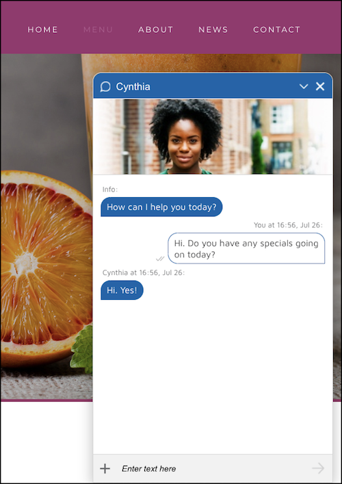
Horizon theme
A new Horizon theme has been added as the default engagement window. The Horizon theme will be the default for both chat and Web Messaging engagements and will impact desktop and mobile experiences. The new theme provides an improved, more modern consumer experience and customization options.
The new Horizon theme features:
- Large window
- New image at the header
- Chevron minimize icon
- Top bar icon is set to "round bubble outline"
- Top window corners radius bigger
- Agent and consumer bubble style set to "three corner rounded"
- Consumer bubble with visual read indication (messaging only)
- Consumer bubble border is blue
- Text area is light gray
- Window closes automatically once consumer ends conversation, or upon submitting the post chat/conversation survey

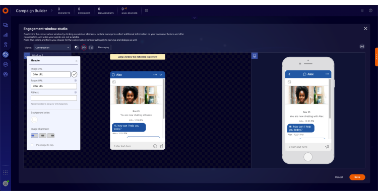
To add a header to the window:
- Click the Add Element button
- Click the +Add button
- Insert the URL of the image
- Click the checkmark button to save
- Insert a Target URL that will open in a new tab when the header is clicked
- Add alternate text that will display when the image fails to load, or for visitors who require visual aid (this ensures the header meets accessibility standards)
- Choose a background color, if you’d like
- Set the position of the header: left, right or middle
- Choose between pinning the header to the top of the window, or letting it scroll up during the conversation
To add an image to the window:
- Click the Add Element button
- Click Select to add an image
- Select an image from the Gallery or click Custom to add your own image
- Choose a background color, if you’d like
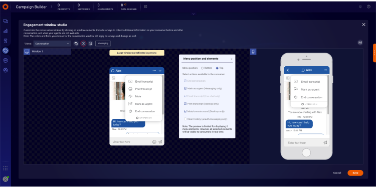
To add additional functionality to your window:
- Click the Action menu button or click the + button in the desktop preview.
- Select the action buttons that you would like to add, e.g., email transcripts. A preview displays on the screen.
- To change the color of the Action menu, click the actions area in the chat window. The action window will open.
- Change the font, background color and/or icon color (dark or bright), as desired.

To add and edit surveys:
Click the Views drop-down menu to view the list of surveys. Then do one or more of the following:
- Click a survey enable button to enable and edit it
- Click a survey to edit it
- Click a question to edit or delete it
- Click Add Question to add a new question
Set the embedded window as floating
Brands have the ability to set the embedded window as floating. Once this configuration is enabled, the position of the window will be 20px from the bottom and 20px from the right. This feature is disabled by default.
Enablement
- Log into the Conversational Cloud
- Go to Engagement window studio
- Click on “Look and feel customization” button
- Enable by clicking on “Floating engagement” checkbox
- Click on “Save”
Limitations
- This setting will impact only the desktop embedded window.
Configure floating engagement window in engagement window studio:

Floating engagement window consumer view:

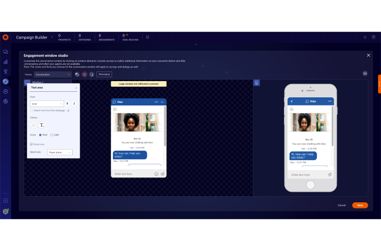
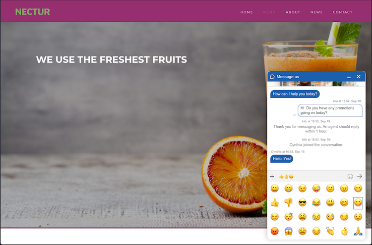
Emoji support
Brands have the ability to configure whether to provide consumers the ability to add emojis to their conversation while using the engagement window on their desktop. This feature is disabled by default.
Limitations
- This feature is available for desktop only.
Enablement
- Log into the Conversational Cloud
- Go to Engagement window studio
- Click on “Text area” section
- Enable by clicking on “Emoji icon” checkbox
- Click on “Save”
Enable emoji icon in the text area:
Consumer view: adding emojis from desktop Web Messaging or chat window
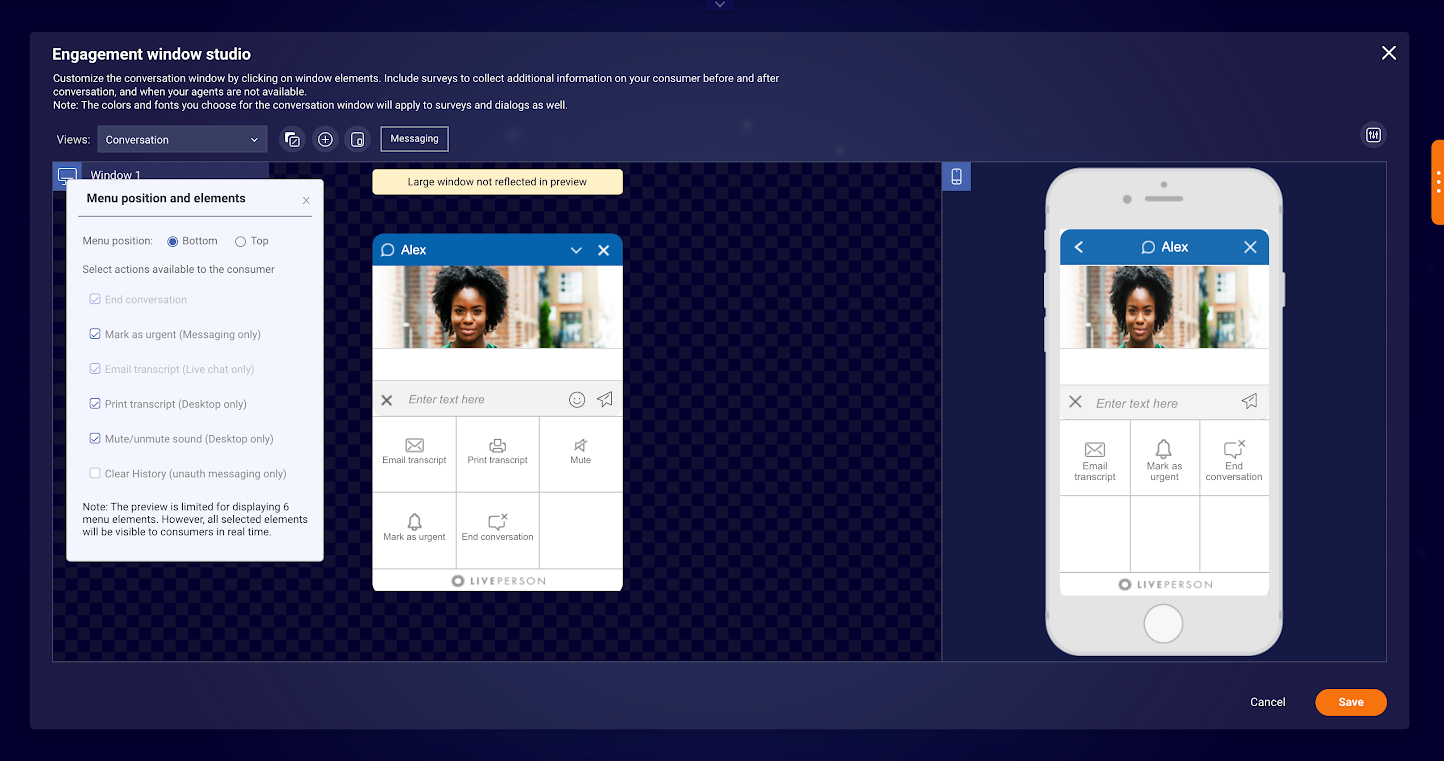
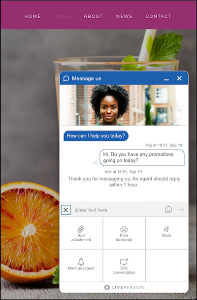
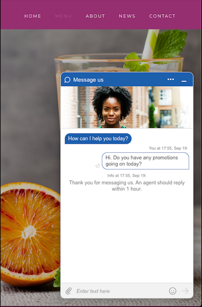
Consumer actions menu location
Brands have the ability to set the consumer actions menu location and elements within the Web Messaging or live chat engagement windows.
There are 2 options to set the location of the menu:
- At the bottom left side of the window (current location and default for Ocean and Horizon themes)
- Top right of the window, instead of the X icon
If the top menu option is selected, the menu icon will replace the X icon (close/end icon). If the consumer would like to end the conversation, they can do so by choosing the end conversation option from the menu.
Enablement
- Log into the Conversational Cloud
- Go to Engagement window studio
- Click on “Add elements” icon
- Click on “Menu position and elements”
- Under “Menu position and elements” section, select the position of the window
- Click Save
Limitations
- The top menu position is available for Web Messaging only and will not be visible in the engagement studio if the window is set for chat.
Configure the location of the menu for the engagement window:

Configure menu to be at the bottom of the engagement window:

Configure menu to be at the top of the engagement window:

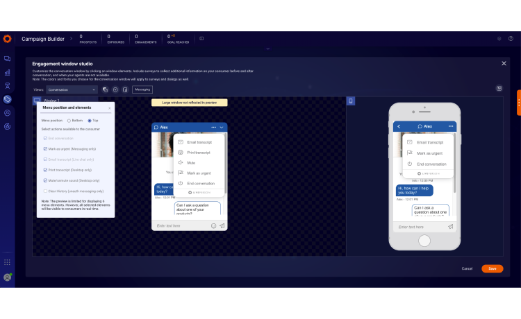
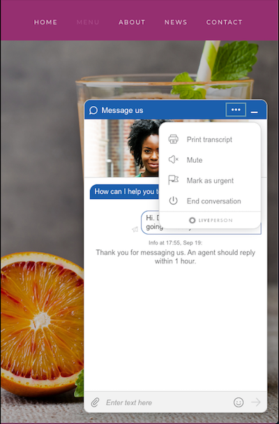
Consumer side top menu:

Consumer side bottom menu:

Add attachment icon to actions menu
When the menu is configured to be at the top for Web Messaging and file sharing is enabled, for the account, the attachment icon is displayed at the consumer text area. Brands have the ability to configure the visibility of the attachment icon within the engagement window. This will be enabled (visible) by default.
Enablement
- Log into the Conversational Cloud
- Go to Engagement window studio
- Click on “Text area”
- Enable by clicking on “Attachment icon” checkbox
- Click on “Save”
Enabled attachment icon in the text area:
Enabled attachment icon on consumer side:

Advanced window configuration and customization
In addition to the styling options within the window configuration, you can make the following advanced configurations:
- Dialog button styling - change the style of the primary and secondary dialog buttons in the engagement window to match your brand design guidelines
- Window icons - customize the top bar by choosing from a list of emojis. The 'Send' and 'End chat' are in the style of the window

Available customizations:
- Agent picture - make the conversation more personal by configuring the agent’s picture to display in the engagement window
- Rounded or square window corners - control the exact radius of the window corners to produce a rounded or square effect
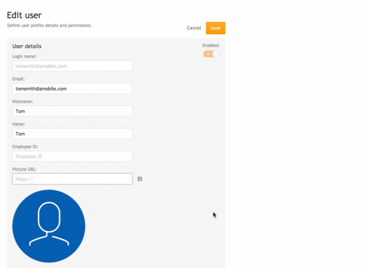
Agent picture configuration
- In the Conversational Cloud, go to the Users tab
- Click on the row with the relevant agent’s name to edit their information
- In the “Picture URL” field, add the URL of the agent’s personal picture

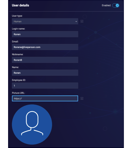
Click Save
Defining agent picture appearance in the engagement window
Agent picture is defined individually per window. If you are using the same window in different engagements/campaigns, visitors will see the agent’s picture in both of them.
In order to define the agent’s picture in the selected engagement window, follow these steps:
- Select the desired window from the Engagement window library
- In the Engagement window studio select Open additional window settings
- In the look and feel dropdown find the agent picture row
- In the value column, select Yes from the dropdown menu in order to enable agent picture for the selected engagement window
- Click Save
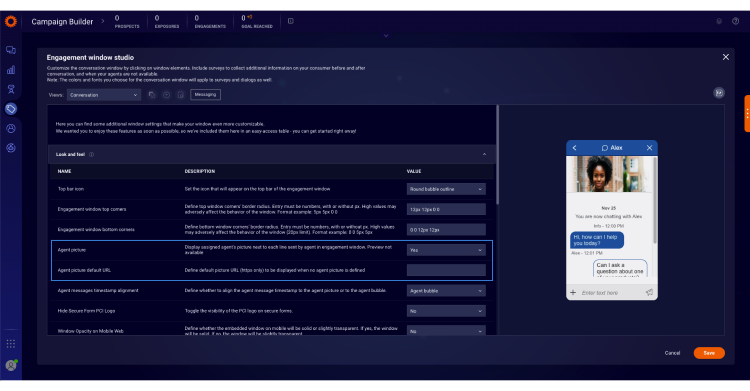
Now the visitor will see their agent’s picture next to each line sent by the agent in the chat engagement window.
Configuring a default picture
In order to define a default picture to be displayed when no agent picture is defined, follow these steps:
- Select the desired window from the Engagement window library
- In the Engagement window studio select Open additional window settings
- In the Engagement window category, locate the Agent picture default URL row
- In the Value column, add the URL of the default picture to be displayed for agents who did not configure their picture
- Click “Save”
Visitors will now see the configured default picture beside each line sent by the agent with no configured personal picture.
Limitations
- Join conversation: If a second agent joins the conversation for whom a default picture URL is defined, the visitor sees the default picture next to second agent’s lines.
- Because each window is configured separately, take into account the following: In the case that different default pictures are defined in different engagement windows, when an agent transfers the conversation to an agent that has no assigned picture, the default picture displayed is the default picture defined for the conversation’s original engagement window. This is relevant to accounts using separate engagement windows for different departments.
Rounded or square window corners
Brands have the ability to set the radius of the top and bottom corners of the engagement window. The additional setting “Engagement window bottom corners” has been added to the “Additional window setting” section of the engagement window studio. The radius must be set in numbers, with or without px. Format example: 0px 0px 5px 5px. The limit will be 20px. An invalid format notification message will be displayed if the number is entered beyond the limit number.
By default the corner settings will be 0 0 0px 0px , which means that the corners are square, as today. This will apply to the embedded window, and the pop out, for both mobile and desktop.
Enablement
- Log into the Conversational Cloud
- Go to Engagement window studio
- Click on “Open additional window settings”
- Click on “Look and feel” section to expand
- Enter values for “Engagement window top corners” or “Engagement window bottom corners"
- Click on “Save”

Missing Something?
Check out our Developer Center for more in-depth documentation. Please share your documentation feedback with us using the feedback button. We'd be happy to hear from you.