Creating buttons and banners
Choosing your engagement type
The Conversational Cloud offers a large variety of engagement types and formats, so how can you know which engagement type and format to choose?
To determine which type of web engagement is appropriate, ask yourself a few questions: first of all, determine whether you want to offer a conversation engagement or a content banner. Conversation invitations provide your website visitors with an opportunity to engage with your agents in real-time, while content banners are most useful when you want to make your users various offers that do not require real-time handling.
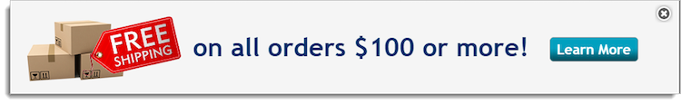
For example, a content banner can be displayed to offer visitors free shipping on all orders over $100. When visitors click on the banner, they can be redirected to a predetermined URL, where they can make a purchase and enjoy the free shipping offer. They are not invited to initiate a conversation, yet you have moved them further down the funnel towards conversion.

Content banners can also be used to redirect visitors to your community page, to FAQs, to your knowledge base, or to any other URL that you configure.
What are my options?
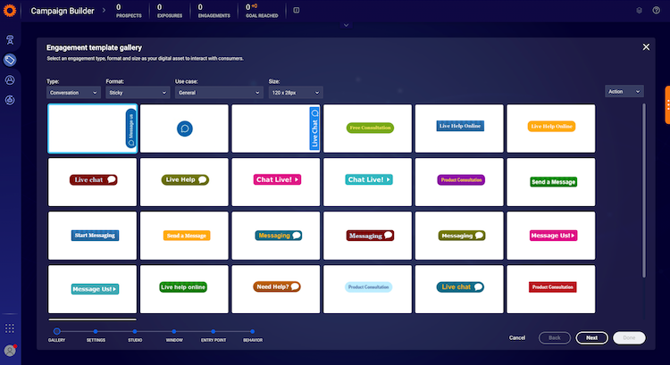
Browse the engagement template gallery and check out the formats: Sticky, Embedded, Overlay, Toaster, Slide-out, and Peeling corner banners and buttons.
Available Use Case Designs
Feel free to use the ready-made templates or to customize them to match the look and feel of your brand. The different-sized templates provide additional designs, so check them out too.

Format Options
Embedded engagements
Embedded buttons are embedded within the code of your page, and will remain in the same place relative to the webpage. When the button is relevant to the context of a particular page, an embedded button is the right choice.
For customers using chat, the embedded engagement will display even if no agents are available. When consumers click on the engagement button, they will be directed to an offline survey (the content of which can be configured in the engagement window studio).
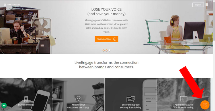
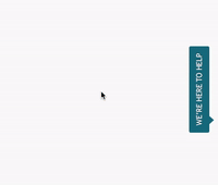
Sticky engagements
Sticky buttons stay in the same place relative to the screen, so even when the user scrolls, the sticky button remains in the same place. Only one sticky engagement can be displayed on each side of the webpage. Sticky buttons are easy for the visitor to locate no matter where they are on your site, so they are useful.

Two new sticky engagement invitations were added to the engagement template library to improve consumer experience and to ease customization and branding.
The new invitations are:
- The small round bubble only (no text)
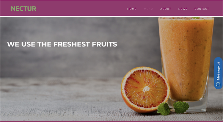
- Rectangle with bubble and editable text “Message us” (this is now the default for new accounts and new engagements)
Message our engagement:

Rounded bubble engagement:

As part of the engagement gallery, brands now can create floating engagements to invite the consumer to message.

Slide-out engagements
A slide-out engagement is very similar to a sticky engagement, except for the way it appears on the page. It is configured in two parts: a small sticky engagement is displayed first. When clicked, a larger banner slides out from the side of the screen. This engagement is useful when you want to draw consumers in with an engagement and then offer them more detailed information in the banner.

Proactive engagements
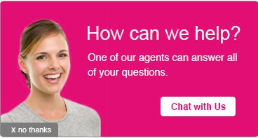
Proactive engagements offer a rich, hard-to-miss experience for consumers and are available in a variety of formats including Overlay, Toaster, and Peeling corner.
Overlay banners appear on top of page content. They’re ideal for messages you don’t want your visitors to miss - like important notifications or messaging/chat invites.

Toaster banners slide out and retract from the bottom or top of the page. They’re a great way to promote special deals or offer support through messaging/chat invites.

A peeling corner banner acts as a teaser triangle that expands when users peel back more to see the whole message. They’re often used to promote offers, especially when there are a lot of images or written content.

Engagement Settings
To ensure the experience is both engaging and non-intrusive, the Conversational Cloud offers the following settings:
Number of displays
This setting allows you to limit the number of times a proactive engagement is displayed in total during a visit. When the limit is reached, no other proactive engagements will be displayed in that visit. You can select from one, two, three times, or unlimited, which is the default setting. You can also select different settings for conversation and content engagements.
Invite after decline
This setting allows you to define the behavior after a consumer declines a proactive engagement, by selecting whether or not other proactive engagements can be displayed afterward. For example, you can decide to display a proactive conversation engagement for one Line of Business, even if a proactive conversation engagement for a different Line of Business was previously declined.
By default, after declining a proactive content engagement, other content engagements can be displayed. After declining a proactive conversation engagement, conversation engagements cannot be displayed.
Previewing your engagement
Once you’ve selected the buttons and banners for your engagement, you can see how each of them looks by clicking Preview in the engagement studio.

Best practices for mobile engagements
As web engagements can be accessed from desktop or mobile devices, when creating an engagement for your website, it is important to remember that it applies to both the desktop and mobile versions (unless you set your target audience to mobile or desktop only).
We suggest following these guidelines when designing buttons and banners for mobile devices:
- Sticky buttons on mobile will always have the same default look and feel
- Overlays should be 440*305 px
- Toasters should be 140 px wide
- Before publishing the campaign on all your web pages, test the engagement’s look and feel on a page that is rarely visited (by defining a location that contains this page)
- Keep the amount of text to a minimum - real estate is limited on mobile devices
Creating accessible engagements
The Conversational Cloud visitor experience meets disability accessibility requirements and follows stringent industry standards, including ADA and WCAG 2.0 AA compliance. This applies to the engagement window, engagements, and surveys for both the desktop and mobile web (iOS and Android).
The following features are supported out-of-the-box for all engagement types:
- Engagements are fully compatible and keyboard operable. You can navigate to the engagement using the tab key and “click it” using Enter or Space.
- On mobile web, you can use gestures for navigating to and operating an engagement.
- Engagements are announced by and can be operated using screen readers.
To create an accessible engagement:
1. Create your engagement as you want it to appear on your website. Include any text, images, and buttons using the engagement studio. Use simple and clear language for users with cognitive disabilities.
2. Ensure text and background color ratio (for vision-impaired visitors): Text and background color contrast ratio should be at least 4.5:1, unless the font is at least 18 point or 14 point bold, in which case contrast ratio should be at least 3:1. You can use various tools available on the web to verify the contrast ratio.
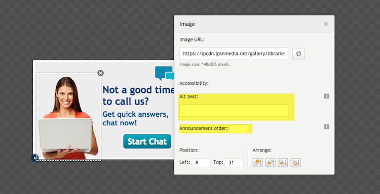
3. Add alternate text to each image in your engagement window graphic:
a. Click an image in the engagement window graphic. A settings window for the image opens.
b. Under accessibility, in the Alt text box, enter alternate text for the graphic element you selected, as follows:
- If the element image conveys information, the alternate text should convey the same information.
- If the image is for decoration only, the alternate text should be ““ (two double quotes one after another, with no space between them). This text will be announced by screen readers for visually impaired visitors. Note that if “” is used, it will not be announced.
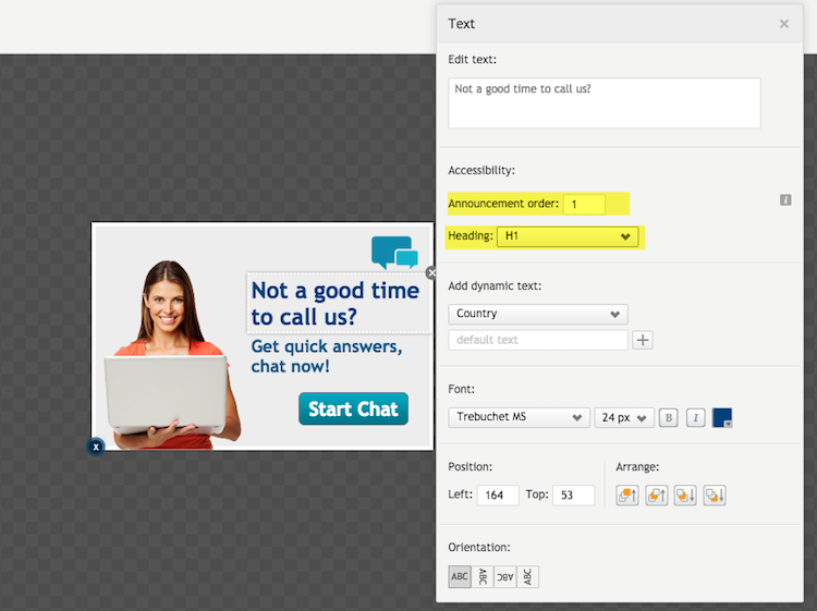
4. To ensure that the elements in the engagement are announced in the order you require, define the announcement order of each element in your engagement window graphic. Click each element (text, image, button) and fill in the number corresponding to the order in which it should be announced. Use whole numbers. The first element that should be announced should contain 1, the second 2, etc.
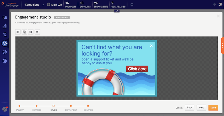
5. To enable navigation by heading using screen readers, define headings and heading levels in the engagement graphic. For example, in the graphic below, “Can’t find what you are looking for?” is a heading, while the remaining text is not. Click the text element and select the heading level from the heading dropdown list. The heading level should suit the hierarchy of headings on your page.

6. Save the engagement.
For more information on accessibility requirements, refer to the Web Content Accessibility Guidelines (WCAG) 2.0.
Customizing Engagements Using HTML Code
The Conversational Cloud provides you with an HTML engagement type that gives you granular control over the look, feel, and behavior of your engagements. By implementing your HTML code, you can design your engagements according to your needs.
Prepare Your HTML Engagement Code
When writing HTML code for your engagements, take into consideration the following:
- Supported HTML Code: HTML code that includes scripts is not supported.
- Test Your Code: It is recommended that you test your HTML code before using it in the Conversational Cloud. If your code depends on resources on your website, such as CSS, you should test it on your website first. If it is not dependent on resources on your website, you can use online code editors such as https://jsfiddle.net/.
- Accessibility: Verify that your code is compliant with the Web Content Accessibility Guidelines.
Set up an HTML Engagement in the Conversational Cloud
Once you’ve prepared HTML code for your engagement, set up your engagement in the Conversational Cloud.
To create an HTML engagement in the Conversational Cloud:
- Create or edit a campaign (Campaign Builder > Add campaign or click an existing campaign). The campaign edit window opens.
- Click Add engagement
- Select Web as the engagement source. The Engagement window studio opens.
- Select Embedded or Overlay from the Format list.
- Select Chat or Content from the Type list.
- Click the HTML engagement template and click Next.
- Enter your HTML code in the HTML code box.
- Add actions such as Click and/or Close to your engagement, as desired:
- Place the cursor in the code at the point where you would like the action to be triggered (to add the on-click event).
- Select the desired action from the Add action list (refer to the table below for the full list of actions). The action code is added to your HTML code.
- Set the position of your engagement:
- For an Embedded engagement, enter the id of a div on your page where you want to display the engagement.
- For an Overlay engagement, go to the Size & Placement menu and select an out-of-the-box option or a custom position.
- In the settings menu, select the chat and engagement settings.
- Click Next or Done. The engagement is saved and exposed to visitors on your website based on the engagement’s campaign settings.
Supported Actions
| Action | Supported Formats | Description | the Conversational Cloud Code |
| Click | Overlay and embedded | Adds a click action to content engagements. | data-LP-event = "click" |
| Click to chat | Overlay and embedded | Adds a click action to content engagements. When clicked opens a chat window. | data-LP-event = "click" |
| Close | Overlay only | Adds a close engagement action to content and chat engagements. | data-LP-event = "close" |
Missing Something?
Check out our Developer Center for more in-depth documentation. Please share your documentation feedback with us using the feedback button. We'd be happy to hear from you.