Analytics Builder getting started
Getting started
Look and feel
The Analytics Builder's predefined dashboards include diverse data visualizations in multiple color schemes.

Access
The Analytics Builder can be accessed through the Quick Launch menu which is located on the bottom left of the navigation panel.
Navigation
You can navigate among different data views within each dashboard at the top of each chapter.


KPI widget
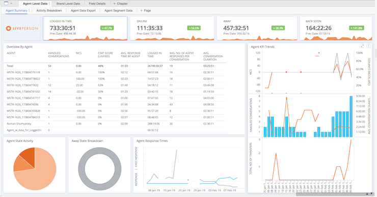
The KPI widget provides a quick visual snapshot of the current value of a KPI and how that KPI has changed over time.

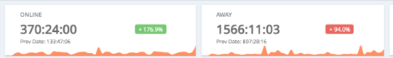
The widget displays:
- The previous date value data
- Trend Indicator (X%) which shows the trend between the previous date and the current date. The color will be green to reflect an improvement in the KPI and red to reflect a negative change.
- Trend Graph which shows the trend for the filtered date range.
- Tooltips when hovering over the trend graph to see the date and value.
View-only user experience
For clear presentation for users with view-only permission, the filter panel is on the right, which displays the data in the main focus area.
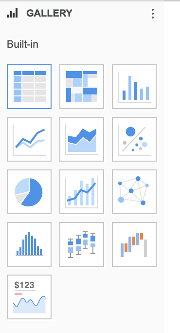
Data visualizations
There are various available visualization types (histogram, waterfall chart, box plot) for creating custom dashboards.

Personalized view
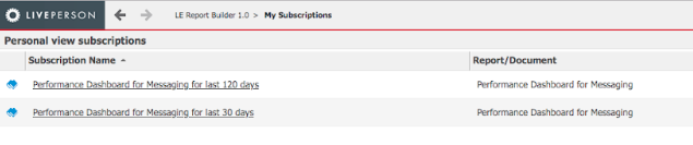
Users can save their customized personal view of the dashboard. A personalized view is a lightweight copy of a dashboard and includes every change that was made to the dashboard including filtering the report period time frame and the offset selector. These updates will save time when choosing data to analyze and it allows you to define different views on the same dashboard without having to re-select the filters on the dashboard. To create and save a personal view go to the File menu, select ‘Create Personal View’ and change the name to a meaningful name. To run a personal view, after launching the Analytics Builder, select ‘My Subscriptions’ where you will see all your personal view subscriptions In the personal view subscriptions area, click the name of the personal view to run or edit it. For example, you can create a view on the Agent Activity Dashboard for the last 30 days filtered for internal employees only and another view of the offshore team for the last 120 days.

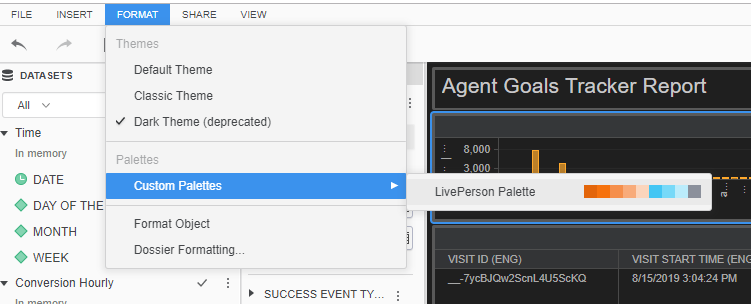
If there is a need to update existing user copies of the dashboard to the new color palette, this can be done manually in the Analytics Builder. After opening the required dossier, go to the ‘Format’ Menu and choose ‘Custom Pallets’ -> LivePerson Palette, and then save the changes.

Exporting to PDF
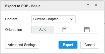
Users can export dashboards to a PDF file and include custom visualization formatting and automatic, portrait, and landscape layout options. They can use Advanced mode to export each visualization individually on separate pages to include all data. Export pdf is limited to 100 pages.

Missing Something?
Check out our Developer Center for more in-depth documentation. Please share your documentation feedback with us using the feedback button. We'd be happy to hear from you.