Insights user guide
Introduction
LivePerson Insights is a powerful text analytics tool that allows you to join the structured data and the text in your conversation transcripts to identify correlations between what is being said and done in the conversations and your KPIs. Conversations from the prior day are copied overnight from the LivePerson database, transformed and stored in the Insights database, and ready for reporting the next day. The Interactive Dashboard allows for drilling down by customer topic, agent response or KPI.
Key Components of the Dashboard:
Tabs
Insights Dashboard is organised into ‘Tabs’ containing ‘widgets’ which display visualisations of data. Across the top of the dashboard, you will see the following tabs:
Overview Tab
This tab displays the summary statistics associated with your data, such as Number Of Records (i.e. No. of Conversations)
- Click on any visualisation to drill into a particular Day, Device Type, Skill etc
- Select a range of items (e.g., Days) on any bar graph by pressing the left mouse button down and dragging across bars.

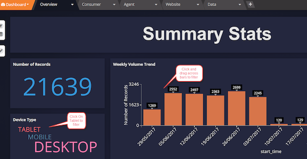
The Overview Tab - Example Widgets seen in Overviews
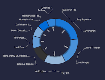
Customer Tab
- This tab is used to display the Voice of Customer. Views are based on the text from the customers’ side of the conversation.
- This tab contains the results of machine learning and taxonomies (unsupervised theme detection and theme detection based on predefined categories) generated using the customer verbatim in transcripts
- The Topic Wheel categorises conversations into groups that are similar in terms of semantics and words used.
Example Topic Wheel

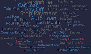
- The word cloud to the right of the wheel displays the most significant word pairs (bi-grams) used by customers, in terms of frequency. The size of the bi-gram indicates its significance. Bigram colours indicate sentiment - positive (blue), neutral (grey) or negative (red)
Note:
Instead of relying on sentiment, we recommend that customers use their own metrics (e.g., CSAT, NPS, FCR) as a more robust indication on how consumers feel about their brand
Example Word Cloud

Taxonomy results are based on a Boolean keyword-based set of rules used to categorise text based on labels of the creators choosing
Example - What is my account balance?
- Rule: ‘account’ AND ‘balance’ NOT ‘transfer’
- This rule would pick up sentences which contain account and balance but not transfer, picking up account balances but not balance transfers.
For more detail, please refer to the taxonomy guide:

Agent Tab
- This tab is used to display the Voice of Agent. Views are based on the text from the agents’ side of the conversation.
- This tab contains the results of machine learning and taxonomies (unsupervised theme detection and theme detection based on predefined categories) generated using the agent verbatim in transcripts
- The Topic wheel categorises conversations into groups that are similar in terms of semantics and words used
- The word cloud to the right of the wheel displays the most significant word pairs (bi-grams) used by agents. The size of the bi-gram indicates its significance. Bigram colours indicate sentiment - positive (blue), neutral (grey) or negative (red)
- Taxonomy results are based on a Boolean keyword-based set of rules used to categorise text based on labels of the creators choosing
Website Tab
- For Web Chat programs, the website tab is used to indicate where customers are coming from.
- Chat Start URLs indicate where the the customer started the conversation
- Other Web related visualisations are displayed here, including browser and device type
- Topics (taxonomy results) are also displayed on this tab to help identify the topics and drivers by URL

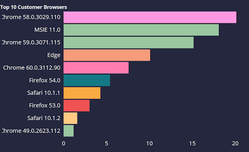
Example Visualisations - Browser & Device Types, Topics
Data Tab
- This tab displays all data contained in the datastreams (databases) upon which the Dashboard is based.
- This tab allows you to search within any data dimension (field) and see the record results either within each taxonomy / machine learning model and across all dimensions.
- Data Text Box - here you can select the datastream you want to look at. Search by clicking in the box which brings up a list of fields to search.
- Magnifying Glass - Type in your search term here to see data filtered by search text
- Tabs below the search fields show all models / taxonomies. The ALL tab shows the values for all original fields as well as all fields from all models / taxonomies.
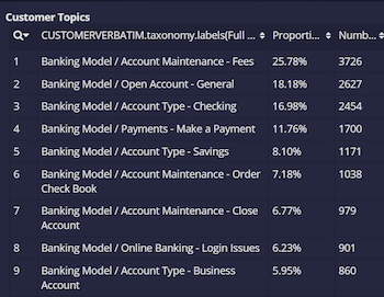
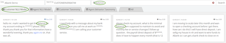
‘Balance’ search results, searching by Customer Verbatim and choosing Customer NLU Model
Results show previews of conversations.

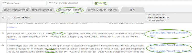
‘Balance’ search results, searching by Customer Verbatim and choosing Customer Taxonomy
Results show associated Taxonomy Labels of conversations.

Key Components of the Dashboard:
Widgets
Each tab contains a selection of widgets - visualisations of data dimensions in the form of tables, lists or charts
Clicking on the menu bar in the top right of any widget brings up a menu to Edit, Copy, Filter, Export or Remove the Widget.
Please note: If you are designated as a ‘view only’ user, you can add filters and rearrange the views. However, any changes made to the dashboard will be erased once you exit out of the dashboard. The administrator of the dashboard controls your permissions.
Widget with Open Menu


Copying Widgets
Click Copy from the menu in the top right corner of a widget. Right click anywhere within any tab of the dashboard to paste the copied widget.
Creating and Editing Widgets
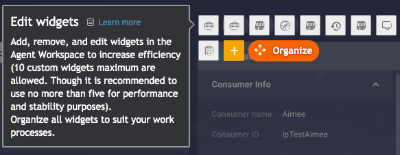
If you have edit permission, you will be able to create new widgets and make changes to the data and configuration of existing widgets.
Clicking the big PLUS SIGN button in the bottom right of any tab opens the Widget Editor, allowing you to select data dimensions and visualisations for a new widget.
To edit an existing widget, click Edit from the menu in the top right corner of the widget. This opens the Widget Editor, allowing you to amend the data dimensions and visualisations required for the widget.
The Widget Editor

Common Visualisations:
Gauge
This is the default visualisation for Sentiment Fields. A gauge, resembling a dial or speedometer, uses a needle to show information as a reading on a dial. You read the value for the needle against a colored data range: red, grey, and blue by default. Use this visualisation type to show key business indicators.
Bar Chart
This requires at least one numerical dimension. This visualisation is best suited to looking at record counts over a period of time (e.g., weeks). Bar charts are also best used to represent distribution of a handful of items, e.g., CSAT scores 1 - 5
Line Chart
This requires at least one numerical dimension. Line Charts are best used to visualise a KPI trend over time, e.g., CSAT / NPS Scores.
Pie Chart
This requires at least one numerical dimension. Pie Charts are best used to show relative proportions of a small amount of items, e.g., Device Types
List
Requires one dimension. Lists are best used for fields which return a large amount of results and would therefore not chart cleanly. Taxonomy results and Chat Start URLs are commonly used in list format.
Exporting Widgets
Click Export from the top right corner of a widget. From here you can export the contents of the widget in a variety of formats, including Excel or Graph (image) format. When exporting a List visualisation, this will export the number of records set under Amount Shown at the bottom of the Widget Editor
Sorting within a Widget
There are two places you can sort the data within a widget.
At the bottom of the Widget Editor, you can select the primary Dimension you wish to sort on, in either Ascending or Descending Order. This will define how data is presented in the widget
You can also temporarily sort on any dimension in a list visualization by clicking the up/down triangles to the right of each dimension displayed in a widget.
Searching within a Widget
Clicking on the magnifying glass in the top left of a widget displaying a list visualisation, opens a search bar. Here you can search within a particular field or ‘Any Field’.
Missing Something?
Check out our Developer Center for more in-depth documentation. Please share your documentation feedback with us using the feedback button. We'd be happy to hear from you.