Week of March 15th
New updates: WhatsApp Business Connector, Analytics Builder
Features
WhatsApp consumer replies
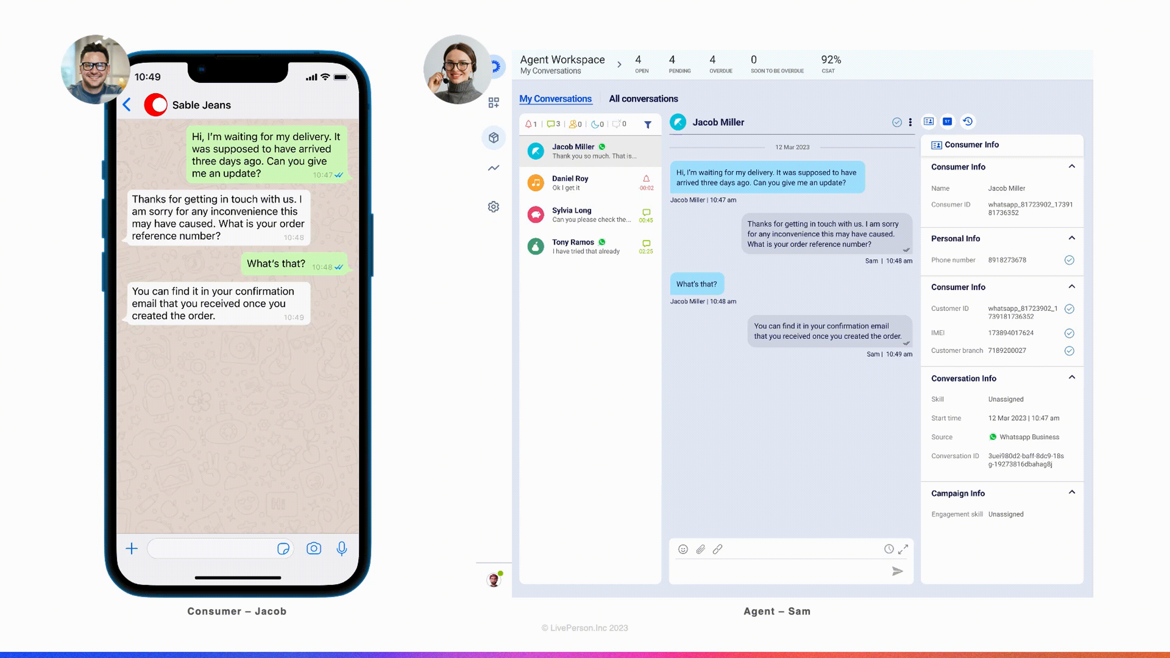
We are delighted to announce that our platform now supports WhatsApp consumer replies, which provide a reference to the message to which the consumer is responding. This feature offers a significant enhancement to the communication experience between brands and consumers. Agent Workspace enables agents to view the specific message to which the consumer is replying within the conversational transcript.
Key Capabilities:
- Our platform enables agents to gain visibility into the messages to which consumers are responding, offering a more comprehensive context for the conversational flow.
- Support of consumer replies to any message type, including replies on consumers messages or those sent by agents.

WhatsApp Consumer Replies
We believe that this new feature will provide a more seamless communication experience for brands and consumers alike, and we are excited to see the positive impact it will have on your conversations. Please feel free to reach out to our support team if you have any questions or feedback.
Limitations:
- This feature is currently available only for the consumer replies.
- Parent messages are limited to 70 characters.
Features
Analytics Builder Platform Upgrade
Analytics Builder is based on a third-party BI tool, Microstrategy (MSTR). In order to ensure system’s stability and performance, Analytics Builder will be upgraded to the latest Microstrategy version.
The version includes new and exciting capabilities you can leverage while creating your own reports in Analytics Builder. Highlighted are a few of the new and most significant features.
Free form layout
The top toolbar displays a few new icons and capabilities, one of them being a “free form layout” button added to the top toolbar.
Up until today, containers (such as visualizations, filters, selectors, images etc) automatically filled the entire canvas and were repositioned around each other. With this release, you can enable a “free-form layout” which allows you to independently organize, position, size, and layer containers on a page.
To enable free format, go to the “convert to free-format layout” button on the top right corner of the tool bar:

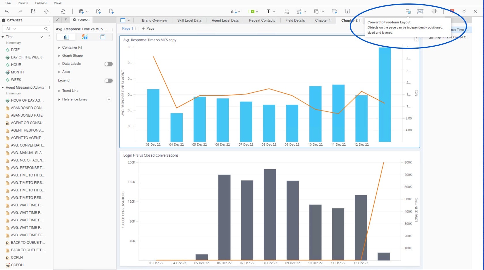
"Convert to Free-Form Layout" button located in the top right corner of the tool bar.
Once clicked, you will be able to reposition the objects in any location on the canvas. You can always go back to the automatic layout by clicking on the “Convert to Auto Layout"

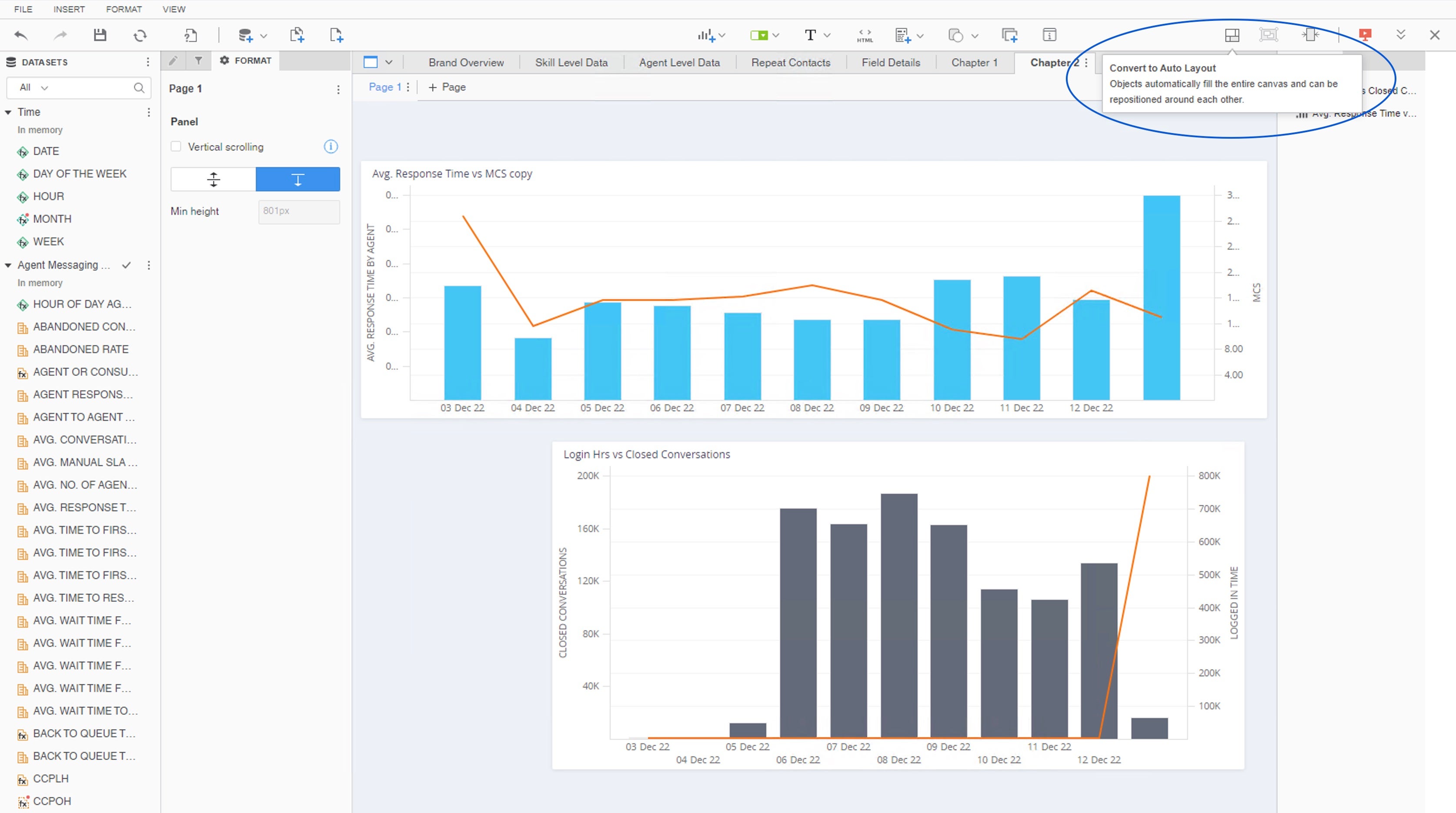
You can always go back to the automatic layout by clicking on the “Convert to Auto Layout"
For further information please read here.
Vertical Scrolling
As a dashboard designer, sometimes you need to add additional content on a page that is already perfectly formatted. Vertical scrolling allows you to add additional blank space at the bottom of your page, so you can easily continue adding visualizations and more without needing to resize everything.
To add more space, go to format and check the “vertical scrolling” checkbox. Increase the minimal height by adding more pixels.

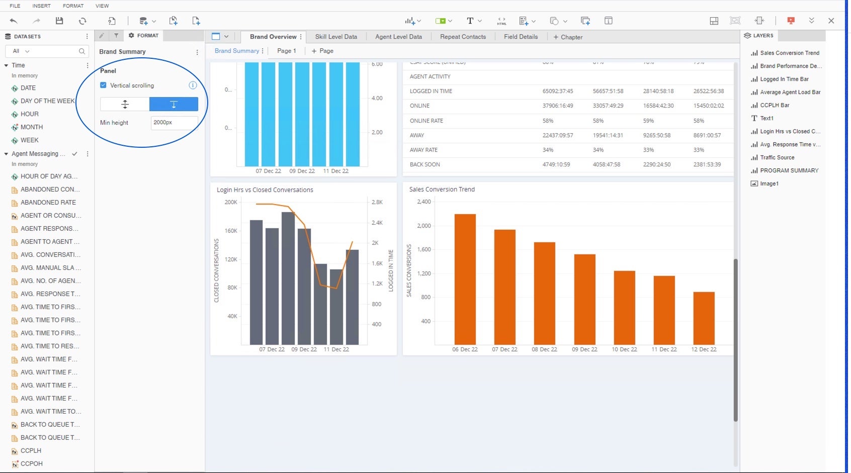
Enable vertical scrolling to add additional space to your canvas.
For further information please read here.
Attribute\Metric selectors
Up until now, clicking on the filter icon located in the top toolbar has automatically added a filter object to the canvas, allowing users to create filters which would impact specific visualizations in the dashboard (unlike the chapter level filter which impacts all visualizations).
As of this version, clicking on the icon would open a window of three options, including ytwo new capabilities:


New filter options available when using the filter in the top toolbar.
- Element/Value filter
Allows adding filters which impact specific visualizations in the page according to the user's choice. That was the existing filtering capability up until today when clicking on the filter icon.
- Attribute/Metric selector
A new capability introduced which allows users to dynamically change the analyzed attributes or metrics in selected visualizations, without the need to create identical pages for each metric or attribute.
- Metric selector example: when investigating a decline\incline in one of your metrics, you would usually want to break the data down by the different reasons such as date, agent, group, skill, source, campaign, engagement etc. Metric selector allows you to dynamically switch between metrics is your visualization and keeping the original attributes. It saves the need to create the same graphs over and over again for different metrics.
- Attribute selector example: when analyzing the number of closed conversations by agent, group and skill, as well as see the daily results by each one of these attributes. Attribute selector allows you to dynamically change the attributes in all visualizations, so you can keep the same graphs (metrics) and change the attribute dynamically.
For further information please read here.
- Panel Selector
Panel selectors are only relevant when using "Panel Stacks", as described later in this article. Panel selectors enable users to seamlessly navigate between different pages of the panel and can be located in any area in the canvas.
Panel Stack
You can find the “Panel stack” button added to the top toolbar. Panel stacks allows users to create a tabbed-object within a page. They act as mini dossier canvases and support all objects you can add to a page, such as shapes, visualizations, text boxes, etc.
Some benefits of using panel stacks:
- Allows designers to be more economical with their dossier layouts and unlock new avenues for creativity in free-form dossiers.
- Self-service can be difficult because it requires authors to anticipate all needs. Panel stacks solve this by allowing authors to create all views up-front.
To add panel stack to your dashboard click on the “Panel Stack” button in the top toolbar.

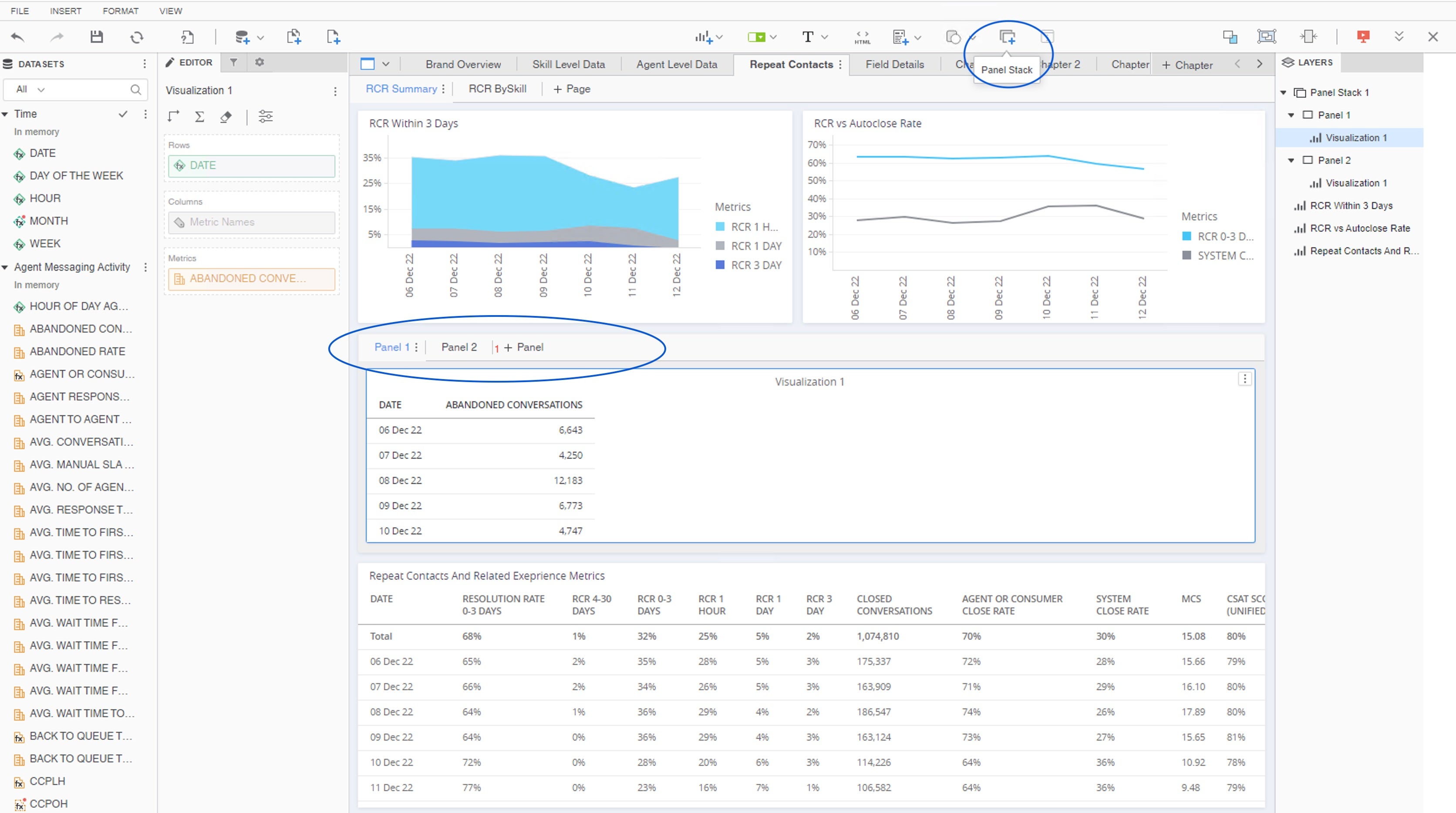
Adding Panel Stacks
For further information please read here.
New Visualization Types
New useful visualization types have been added, such as compound grids, Gauge KPI, Sankey Diagram, and more.
Also you’ll notice the user experience of adding visualization has changed a bit. As of this version, clicking on the visualization icon first opens the visualizations window, asking the user to select the desired visualization and only afterwards adding to the canvas.
Rich Text
You now have the ability to add rich text. Unlike regular text fields, you can use rich text to apply rich formatting to the individual character level to create compelling infographic style dossiers. For further information please read here.
Shape
As of this version you’ll be able to add different shapes into the canvas, such as lines, rectangles, triangles etc to help frame a visualization, create a layered effect, or visually group elements together.
For further information please read here.

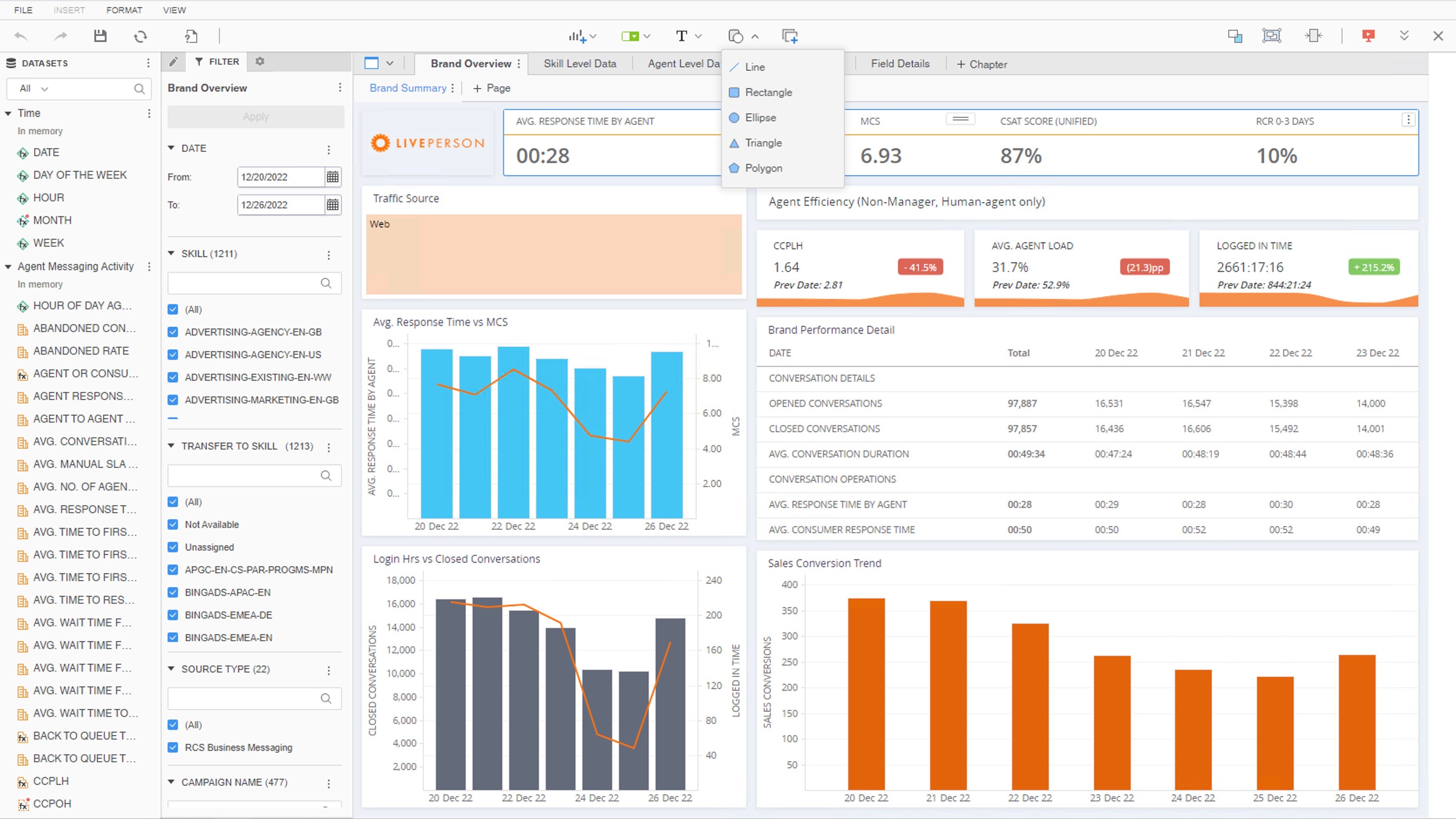
Adding shape to the canvas.